

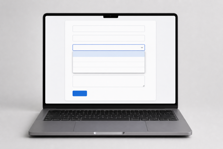
Select menus are small interface elements with an outsized effect on completion rates, accessibility, and user confidence. They appear in account forms, checkout flows, product filters, settings pages, and onboarding steps. A well-designed menu makes a choice feel fast and obvious. A confusing one can make even a simple form feel harder than it needs to be.
Before designing a component, review real patterns in a selector UI collection and focus on the underlying task rather than surface styling. The strongest examples make the current value, available choices, and next action easy to understand without forcing people to guess how the control works.
Why Select Menus Still Matter
A select menu lets people choose one item from a known set without filling the page with every possible option. That saves space, but it also hides information. Users must open the control before they can compare choices, so the menu needs to feel predictable at first glance.
Think of common tasks such as choosing a billing country, a delivery window, a subscription plan, or a preferred language. In each case, the control should clearly communicate its purpose, reliably display the selected value, and behave consistently across devices. The goal is not a flashy dropdown. It is a quick decision with minimal effort.
Choose the Right Control
A select menu is useful when people need a single option from a moderately sized list, and available screen space is limited. It is not automatically the best answer whenever a form has choices.
- Use radio buttons when there are only a few choices and users benefit from comparing them all at once.
- Use checkboxes when users may select more than one answer.
- Use a search field or combobox for long lists, such as cities, countries, products, or organizations.
- Use a select menu when the options are mutually exclusive, familiar, and easy to scan.
Start With a Clear Label
Every select menu needs a visible label that states exactly what the person is choosing. “Billing country,” “Preferred language,” and “Delivery time” are clearer than generic wording such as “Selection” or “Details.” Keep the label close to the field, and use short language that matches the user’s task.
Do not treat placeholder text like “Choose one” as the only label. Once a value is selected, placeholder-style instructions disappear, and people returning to an unfinished form may no longer understand what the value represents. A persistent label improves scanning, recovery, and error correction.
Keep the Option List Simple
Option labels should use plain, user-facing language. Avoid internal product names, ambiguous abbreviations, and labels that differ by only a few characters. If people have to read every item closely to find the distinction, the menu needs clearer wording or a different interaction pattern.
Order choices for the task
- Sort names alphabetically when users are likely to search by name.
- Use a logical sequence for sizes, steps, price ranges, dates, or time windows.
- Group related options when a longer list has clear categories.
- Keep instructional entries distinct from real answers. For example, “Select a state” should not resemble a valid state choice.
If a list becomes too long to scan comfortably, add search, filtering, or progressive steps rather than making users scroll through dozens of entries. A compact component should not hide an unnecessarily difficult decision.
Design for Keyboard Use
People must be able to reach, open, scan, choose, and exit a select menu without a mouse. In a native control, Tab commonly moves focus to the field, arrow keys move through options, and Enter or Space opens or confirms a choice, depending on the browser and platform. Escape should close an open custom menu without changing the chosen value unexpectedly.
Give the focused control a strong, visible focus indicator that contrasts with the surrounding page. Never remove the outline simply because it does not match the visual style. After a user makes a choice, focus should remain in a sensible place instead of jumping to an unrelated section or triggering a surprise page change.
Make Mobile Use Easy
On phones and tablets, small tap targets and cramped spacing create selection errors. Use a comfortable control height, clear boundaries, and enough space around the field to prevent accidental taps. Keep the label visible when the field is active and after it contains a value.
Test long option names, narrow screens, landscape orientation, enlarged text, and browser zoom. Also, check the validation behavior. An error message should remain near the menu, explain what needs attention, and avoid pushing the active field so far away that users lose context.
Native Versus Custom Selects
Starting with a native HTML element is often the best approach. It comes with built-in keyboard functionality, adheres to platform conventions, and supports assistive technologies, all while requiring less engineering effort. While a custom component may be suitable for features like searchable results, rich content options, grouped data, or advanced multi-select behavior, it is essential that it accurately replicates all necessary interactions.
Custom menus need reliable focus management, announced state changes, touch support, keyboard controls, error handling, and a usable fallback. Newer browser capabilities for customizable select controls make it easier to style built-in elements while preserving their semantics. Even then, every option should retain meaningful text so the control remains understandable in assistive technology and browsers with simpler fallback interfaces.
Avoid Common Design Mistakes
- Hiding two or three simple choices inside a menu when radio buttons would be clearer.
- Adding a long list without search, grouping, or filtering.
- Changing content or navigating immediately after selection without warning.
- Using color or icons as the only indicator of the current value.
- Making a required field appear disabled or unavailable.
- Hiding error messages visually or failing to expose them to screen readers.
- Building a custom dropdown that works with a mouse but fails on touch screens or keyboards.
Test Before Release
- Complete the entire form using only a keyboard.
- Check the control with a screen reader or accessibility inspection tool.
- Try empty, selected, disabled, loading, and error states.
- Test short labels and unusually long option names.
- Review the experience at higher zoom levels and on narrow screens.
- Test on a phone and tablet, not only a desktop browser.
- Ask someone unfamiliar with the task to complete it without help.
Conclusion
Select menus do not need elaborate effects to be effective. The best controls make choices clear, reduce uncertainty, and work reliably across devices and input methods. Start with the simplest control that fits the task, favor native behavior when possible, and test the full experience before release.
Read more : Plumbing Services: Essential Guide for Finding A Reliable Plumber Near Me